


How to demonstrate a Course Dates block


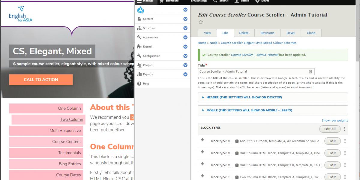
We recommend you login in another browser window, navigate to this page, and click 'Edit'.
You can then hop between this live page and the admin page clicking 'edit' on the relevant blocks see how the different features have been put together.
This block is a single column of text. We're using this one to demonstrate all the different typographic features you can use variously throughout the site, and to explain the colour scheme choices we've made.
Firstly, let's talk about headings. If you give a block a title, it is automatically formatted as Heading 2 - eg 'One Column HTML Block, CS1' at the top of this page. You can break each block up further with subheadings using the Paragraph Format dropdown in the text editor window, for example:
The other buttons in the text editor allow you to style individual paragraphs or phrases Firstly, you have the all the normal features like bold text for emphasis, as well as italicised text for references and titles (eg, Academic References for the Titles of Things, 2021.) At any point in the text you can insert a link to another page or website.
 Important: text format (under the editor) must be "full HTML" to use these icons.
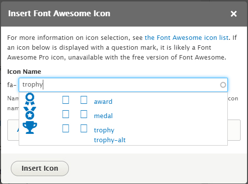
You can insert these icons anywhere by clicking the flag icon in the text editor. You can type any word into the pop-up window and a list of related icons is shown.
The suggestions are intelligent - if you search for 'trophy', you will see recommendations for trophies, medals, awards etc. Select one and click Insert icon.
To delete an icon, highlight the text immediately before and after the icon - you may have to highlight from the previous line/onto the next line.
Some icons are only available with a paid subscription - in these cases, you will not see a preview image by the icon code.
In other cases, icons in the Search will show up as being available in a choice of Solid or Regular formats - if you want to use the regular format, select the icon as normal, click 'Additional Font Awesome Settings' and select 'Regular'. Click 'Additional Font Awesome Settings' again to close the panel, and click 'Insert Icon'.
Solid (default) icon looks like this:
Regular icon looks like this:
 By putting the cursor at the start of this paragraph, and clicking the Image Upload button in the text editor, we've included an inline image. You can ignore the alignment options in the pop-up window, inline images will be resized to 50% of the width of the column, and floated to the right, for consistency.
This paragraph has been styled as a Block Quote by using the quotation mark icon in the text editor. It's useful for pull-out quotes, testimonials and statistics.
This is a condensed duplicate of the block above, but with Template B colour scheme applied. This template applies more stark contrasts in order to highlight key points of information. You can mix or match the templates in one scroller, or use one style throughout.
 Features like image layout, bold text and italicised text remain the same, but there is emphasised styling for links to other pages.
There is a block colour background for block quotes to make pull-out quotes, testimonials and statistics stand out.
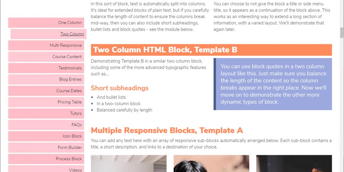
In this sort of block, text is split into columns by inserting a Horizontal Line with the top-right icon in the text editor's toolbar. You must select Text Format: Full HTML under the editor to achieve this. It's ideal for extended blocks of plain text, but if you carefully balance the length of content to ensure the columns break mid-way, then you can also include short subheadings, bullet lists and block quotes - see the module below.
You can choose to not give the block a title or side menu title, so it appears as a continuation of the block above. This works as an interesting way to extend a long section of information, with a varied layout. We'll demonstrate that again later.
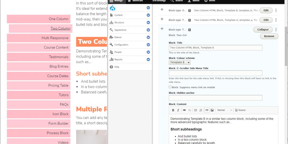
Demonstrating Template B in a two column block, including typographic features such as...
NB: You don't need to use a two column block to split text and images into two columns. This happens automatically on wider screens when you use a single column block (see above).
You can use block quotes in a two column layout like this.
Just make sure you balance the length of the content so the column breaks appear in the right place.
Now we'll move on to demonstrate the other more dynamic types of block.
You can add any text here with an array of responsive sub-blocks automatically arranged below. Each sub-block contains a title, a short description, and links to a destination of your choice.
You can choose to hide individual blocks on narrow screens, and a two-column layout on mobile devices (this does default to single column on the narrowest of phones).
We have provided you with a complete set of black (for Template A) and white (for Template B) images with transparent backgrounds for every percentage from 0% - 100%.
The images are laid out to display responsively on any screen size (hence the percentage is below the number, which is centralised). These display optimally in full row and a two-column layout on mobile.
A course content block allows you to add an FAQ-style 'Accordion' display, containing any number of sub-blocks with information about each aspect of the course. Users can click to expand and collapse each sub-block for in-depth information.
In-depth information here can include straight text; while it's best to avoid using headings and block quotes inside these sub-blocks (they cause a cluttered and confusing layout), you can...
<p>Another block of in-depth text, of any length.</p>
You can add as many of these sub-blocks as you like.
A duplicate Course Content accordion block, formatted in Template B. Users can click to expand and collapse each sub-block for in-depth information.
In-depth information here can include straight text; while it's best to avoid using headings and block quotes inside these sub-blocks (they cause a cluttered and confusing layout), you can...
This text can include links within the drop-down panel.
Another block of in-depth text, of any length.
You can add as many of these sub-blocks as you like.
A testimonials block allows you to add unlimited references from satisfied learners or impressed partner providers, which are displayed in a scroller. Each testimonial consists of a photo of the learner, their name and 'relevance' (eg the course they attended, or organisation they work for), a short explanation of their involvement with EFA, and their comments about EFA's learning provision.
A testimonials block styled in Template B.
A blog entries block showcases the most recent (or a hand-picked selection of) blog posts in a grid showing the blog post's image and title as a clickable link. You select how many posts to cycle through. In Auto Blog Mode, you can select blog categories to include or exclude, and the system will scroll the most recent items. In Manual Blog Mode, you select specific posts by typing their titles into an auto-complete text field.
A course dates block presents a table summary of course dates, course titles, short descriptive subtitles and a link button to direct visitors to a booking system or further information page. You can choose any text for the link button.
The Course Dates block formatted in Template B:
A pricing table contains titles, descriptors and prices for each available item, with a drop-down button for additional information and terms and conditions. You can choose any text for this dropdown button.
Additional detail, or Terms and Conditions, go here.
Additional detail, or Terms and Conditions, go here.
Additional detail, or Terms and Conditions, go here.
A duplicate pricing table, formatted in Template B..
Additional detail, or Terms and Conditions, go here.
Additional detail, or Terms and Conditions, go here.
Additional detail, or Terms and Conditions, go here.
Jennie Fung
CertTESOL Trainer
Sharon Maloney
CertTESOL Trainer
Heath Jeffery
CertTESOL Trainer
Alex Rubenstein
CertTESOL Trainer
Sharon Maloney
CertTESOL Trainer
Similar to a Course Content block, FAQs are set out in an accordion block. In FAQ answers, you can also include optional link buttons to any URL for additional information.
In an FAQ answer, you can include link buttons to other pages, like this one:
The colour scheme is bolder.
A straight-forward slideshow gallery, with every image added and captioned as a sub block. You can set the gallery to auto-play through the images at a chosen interval, or let visitors move through the images manually.
A gallery formatted in Template B is identical, except for the colour of the arrow buttons.
Icon blocks allow you to add a row of up to six quick links with Font Awesome icons automatically styled to your chosen template.
You can hide particular icon sub-blocks on mobile views by selecting 'Sub block: Hide block on mobile' for the specific icon.
On mobile devices (under 992px wide), you can specify whether the icon block display defaults to two columns, or a single column. (NB: On devices narrower than 540px, all icon blocks display as a single column.)
You can add a title, descriptor and button link to each icon entry. Internal links will open in the same browser window, external links will open in a new browser window. To override this default function, add [new] or [this] to the end of the URL, ie to open an internal link in a new window, add [new], and to open an external link in the same window, add [this].
Icons block in template B, set to display two-column wide on mobile. This does default back to single column on the narrowest screens. Remember to use very short subtitles to prevent text overflowing.
This block allows you to embed a Contact form or Newsletter Sign Up form on any scroller.
A process block allows you to compose a diagram of any process, using up to 4 columns.
Give it a title, and an explanation, as above
Give each a short descriptor like this
Add a button to any sub-block, with any text
Template B adds a little more variety to a process block.
Give it a title, and an explanation, as above
Give each a short descriptor like this
Add a button to any sub-block, with any text
<p>A videos block allows you to insert a responsive video using a Youku or Youtube link, simply by pasting in the URL. There is no difference between Template A and B formatting, except for the styling of the title.</p>
To create a table use a single col HTML block and press the insert table button, which is in the toolbar of the rich text editor.
| - | Header | Header |
|---|---|---|
| Header | A | B |
| Column | 1 | 2 |
| Here | x | y |
To create a table use a single col HTML block and press the insert table button, which is in the toolbar of the rich text editor.
| - | Header | Header |
|---|---|---|
| Header | A | B |
| Column | 1 | 2 |
| Here | x | y |
 Ensure the finished page includes a block for applications, with a HIDDEN ANCHOR of 'apply'. This will ensure that inbound links from the 'Apply Now' main menu items will direct the user to the right point in the page.
Under 'APPLY NOW' settings for the Course Scroller, set the APPLY NOW LINK to '#apply'. This will create a working APPLY NOW link in the Course Scroller Side Menu.